Wednesday, May 11, 2011

All About the Alphabet

We recently did a project called "A to Z Scavenger Hunt" where we had to take 26 pictures, each representing a different letter of the alphabet while also adhering to the rules of photography we learned previously.

The picture below was actually taken in my Physics classroom during a lab involving a meter stick and a lit candle. You can see a boys face faintly in the background, and his fingers are about to put out the flame. I chose this picture because I love how dark the background is compared to the illuminated candle and the light it put onto the meter stick. It represents move it from the middle, leading lines, and blurred background. I titled it "Intense Flame."


I chose the next picture of my friend Ben walking past an old trailer because I liked the angle and contrasting colors and the fact that the person isn't necessarily the focal point of the photograph. I titled this one "Nature Walks," and it represents leading lines, blurred background, and unique angle.


The last picture I chose is titled "Laughter," obviously because the girls are laughing. I captured my friends Hannah and Samantha in their moment of laughter before the Ke$ha concert, and I liked how their tough outfits contrasted with their frivolous expressions. This picture represents emotion and blurred background and somewhat fill the frame/close-up.

Wednesday, April 20, 2011

Photo Essay

 My photo essay topic was tattoos, so I went to Bella Donna Tattoo Company on Westheimer Road to get pictures of people getting tattoos. The three pictures in the post are my favorite out of the 14 that I used for my project. The one to the right is of the final product of a girl's tattoo that reads "everyone is forgiven;" although I only photographed part of the final tattoo I still think it captures a mood that speaks for itself.


This picture below is of a tattoo artist putting bandages on the girl's finished tattoo. I wanted to capture this picture because it shows something other than the needle or finished product and also shows a meaningful tattoo on the artist's fingers.

The above picture is of an artist, who happens to be the owner, in the process of giving a tattoo to a man. The man's finished product will be a treasure chest in between two women pirates. I liked the lighting in this particular picture and the fact that neither men are looking at the camera or each other.

Tuesday, March 29, 2011

Start Snapping!

This picture follows the rule of "filling the frame," and I picked this particular one because I love the way the way the reddish-pink of the flower contrasts the stark green of the leaves. Had I not moved in close to the flower, the picture would not have the same popping effect that it does.

I chose this picture of my dad playing pool as my example of "leading lines." The cue stick leads the viewer's eye to the subject of the picture, my dad. I found this rule the hardest to photograph because most of my pictures either had to be set up or taken at odd angles.


The picture of my bed frame to the right represents the rule of "repetition." I was just sitting on my bed and realized how cool the interlocking circles would look in a picture taken at an angle but that still showed their obvious repetition.

Wednesday, March 9, 2011

Rules 9 and 10

Rule 9 says that you should "watch the light" when taking pictures so as to not have any unflattering shadows or brightness in your picture. This tip was actually the most difficult for me to do because you have to position your picture just right so that the lighting turns out looking good in the picture. This picture of Samantha is a good example of rule 9 because the shadows accentuate her face but don't hide it.

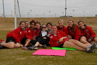
Rule 10 is a fairly easy concept to grasp; this rule states that you should be a director and organize the people in your pictures properly. This was easy to do because i could just take pictures of people sitting or standing naturally like they would then organize them in a better way. In this picture I told the JV lacrosse girls to get together for a picture and told them to move closer together to make the outcome better.

Friday, March 4, 2011

Rules 7 and 8

Rule 7 states that you should move your picture's focus from the center. This tactic is easy to do yet often overlooked or forgotten when one is in the moment. However, I captured some really cool pictures when i actually took the time to think about where objects were in regards to the rule of thirds.


Rule 8 is to know your flash's range. Most people would think that this rule is unimportant, but when one is in a situation with a good photo opportunity, you would most definitely want to know if your picture would even turn out to be visible or not.

Friday, February 25, 2011

Iconic Photo

We randomly picked iconic photos in photojournalism, and i got the infamous picture of the Kennedy family vigilantly watching JFK's funeral procession. The photo was taken outside the St. Matthews Cathedral on Monday, November 25th, 1963 (ironically John Jr.'s third birthday). No one knows for sure who took the picture because it was for government use, but Joe O'Donnell sold a cropped version of just John Jr. saluting his father's casket after his retirement from the White House in 1968. Jackie, Caroline, and John Jr. became national icons not just because they were the first family but also because of this photo. Personally, I see this picture as an icon in the fact that it brought the nation together and displayed the Kennedy family as strong, composed individuals. Each of the Kennedys retained a spark within them and were looked upon very highly by the American public. Sadly, Caroline is the only Kennedy still alive, but she carries with her the famous Kennedy charisma and passion for which the family was known.

Thursday, February 10, 2011

Rules Cinco y Seis


Rule Six: Lock your focus on the subject. The picture above is focused on Luke's hand and the ticket he is holding so that the background does not distract from the subject. I really like this picture because the ticket kind of blocks Luke's face to even further emphasis the ticket and his hand over the hallway in the back.


Rule Five: Take Vertical Pictures When Necessary. The picture to the left would not have the same effect if it had been taken horizontally. The vertical perspective makes the stack of books pop even though the background is busy, and it even looks like the stack is leaning.